
Last updated: October 27, 2026
Brand guidelines are a documented set of rules, usually somewhere between 10 and 40 pages, that define how your brand looks, sounds, and behaves across every channel and touchpoint. The typical set covers your logo, colours, typography, imagery, and voice, with clear examples of correct and incorrect use so anyone working on your brand gets it right without guessing. The amount of detail varies a lot by business. A solo founder might run a tidy one-page reference, while a franchise or a company with several product lines often needs a longer document that spells out rules for sub-brands, co-branding, and regional variations.
What brand guidelines usually include:
- Logo rules: primary, secondary, and icon versions, plus minimum size and clear-space requirements.
- Colour palette: primary and secondary colours with exact HEX, RGB, and CMYK values.
- Typography: brand fonts, weights, sizes, and heading-to-body hierarchy.
- Brand voice: tone, personality traits, and words to use or avoid.
- Imagery: photography style, iconography, illustration, and graphic treatments.
- Usage examples: correct and incorrect applications across real-world layouts.
Key terms, defined:
- Brand guidelines: the full rulebook for how a brand is presented, visually and verbally.
- Brand style guide: often used interchangeably, usually weighted toward visual rules.
- Brand book: a more narrative document that leads with story, mission, and values.
- Visual identity: the logo, colour, type, and imagery system itself, which the guidelines govern.
- Brand voice: the consistent personality and tone your writing carries everywhere.
Treat the page ranges and section lists here as planning references rather than fixed rules, because the right shape for your guidelines depends on how many people touch your brand and how many channels you run. One caution worth stating up front: guidelines only help if people actually use them, so a short document your team reads beats a beautiful 60-page PDF that sits in a folder no one opens. This guide is written for Canadian business owners and marketers who want to understand what belongs in a set of brand guidelines and how to build one that holds up.
Key takeaways
- Brand guidelines document how your brand looks and sounds so every person and partner presents it consistently.
- A complete set usually covers logo, colour, typography, imagery, and voice, with correct and incorrect usage examples.
- Guidelines and brand strategy are different things. Strategy decides what your brand stands for, and guidelines translate that into day-to-day rules.
- Length should match complexity. Many small businesses do fine with a focused document; larger or multi-brand companies need more.
- The best format is the one your team will reference, whether that is a shareable PDF, a slide deck, or a live web portal.
- Guidelines are a living document. Plan to revisit them whenever your logo, product range, or market shifts.
What are brand guidelines?
Brand guidelines are a reference document that explains how to use your brand’s visual and verbal elements correctly and consistently. They take the decisions behind your identity, the logo a designer drew, the colours you chose, the way you want to sound, and turn them into rules anyone can follow. When a new hire builds a slide deck, when a freelancer designs an ad, or when a print shop reproduces your logo on a banner, the guidelines are what keep the result recognisably yours.
Think of them as an instruction manual for your brand. A good set answers the practical questions people run into: Which version of the logo goes on a dark background? What is the exact blue? Can I stretch the logo to fit this space? What tone do we use when we apologise to a customer? Without written answers, every one of those questions gets decided by whoever happens to be doing the work that day, and the brand drifts. With them, the brand stays steady even as the team grows and the number of channels multiplies.
Guidelines sit downstream of your brand strategy. Strategy is the thinking: who you serve, what you promise, how you want to be perceived. Guidelines are the execution layer that makes that thinking repeatable. If you have not nailed down the strategy yet, it is worth reading our guide on building a brand strategy before you document the visual rules, because the rules are only as good as the positioning underneath them.
Why do brand guidelines matter for a business?
Brand guidelines matter because consistency is what makes a brand memorable, and consistency is almost impossible to hold onto without written rules. People recognise brands through repetition. The same colours, the same logo treatment, and the same voice showing up again and again is how a company goes from unfamiliar to trusted. Every time your brand looks or sounds different from one touchpoint to the next, that recognition resets a little.
There is a practical angle too. Guidelines save time and reduce rework. When a designer, a developer, or a marketing hire has a document to check, they stop guessing and stop asking the same questions. Agencies and freelancers can produce on-brand work on the first try instead of the third. That efficiency compounds as you add people and channels.
Guidelines also protect the brand when you are not in the room. The moment you hand work to an external partner, a printer, an ad platform, a reseller, you lose direct control over how your brand gets used. A clear document is how you keep that control without having to approve every single asset personally. Here is a closer look at what guidelines actually deliver.
| Benefit | What it looks like in practice |
|---|---|
| Consistency | Your logo, colours, and voice look the same on a business card, a website, and a Facebook ad. |
| Faster production | Designers and writers reference the rules instead of asking or guessing, so work ships sooner. |
| Easier delegation | New hires, agencies, and freelancers produce on-brand work without hand-holding. |
| Professional perception | A polished, consistent presence signals that the business behind it is organised and credible. |
| Brand protection | Clear usage rules stop partners and vendors from distorting your logo or misusing your colours. |
| Smoother growth | Adding channels, products, or locations is less chaotic when the standards are already written down. |
What should brand guidelines include?
At a minimum, brand guidelines should include your logo rules, colour palette, typography, imagery direction, and brand voice, and most strong documents add a short strategy section at the front for context. The exact mix depends on your business, but the sections below are the ones you see in nearly every well-built set. You do not need all of them on day one. Start with the essentials and expand as questions come up.
| Section | What it covers | Essential or optional |
|---|---|---|
| Brand overview | Mission, values, positioning, and a short brand story for context. | Recommended |
| Logo | Primary and secondary logos, icon marks, clear space, minimum size, and misuse examples. | Essential |
| Colour palette | Primary and secondary colours with HEX, RGB, and CMYK values and usage ratios. | Essential |
| Typography | Brand fonts, weights, sizes, line spacing, and heading-to-body hierarchy. | Essential |
| Imagery | Photography style, illustration, iconography, and graphic patterns. | Essential |
| Brand voice and tone | Personality, tone, vocabulary, grammar preferences, and words to avoid. | Essential |
| Layout and spacing | Grids, margins, and composition principles for consistent layouts. | Optional |
| Applications | Real examples: business cards, social posts, email, signage, packaging. | Recommended |
| Accessibility | Minimum colour-contrast ratios and legibility rules for inclusive design. | Recommended |
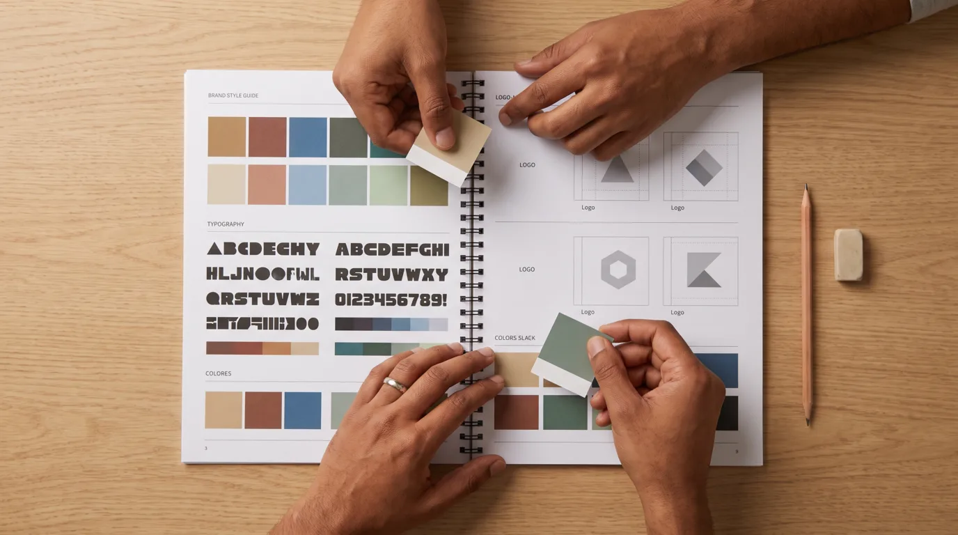
Notice that the document is roughly half visual and half verbal. A lot of first-time guidelines over-index on the logo and forget the voice, which is why so many brands look consistent but sound like three different companies. If you want your writing to carry the same recognisability as your visuals, the voice section deserves as much care as the colour palette.
What is the difference between brand guidelines, a brand style guide, and a brand book?
The three terms overlap heavily and are often used interchangeably, but the useful distinction is scope and emphasis: a brand book leans into story and strategy, a style guide leans into visual rules, and brand guidelines is the broad term that can cover both. No industry body enforces these definitions, so when someone hands you one of these documents, read what is inside rather than trusting the label on the cover.
| Document | Main emphasis | Typical contents | Best for |
|---|---|---|---|
| Brand guidelines | The complete rulebook | Strategy context plus full visual and verbal rules | Most businesses that want one reference for everything |
| Brand style guide | Visual consistency | Logo, colour, type, imagery, and layout rules | Design and production teams focused on execution |
| Brand book | Story and meaning | Mission, vision, values, personality, and the brand narrative | Inspiring teams and introducing the brand to new partners |
For most small and mid-sized Canadian businesses, the practical answer is to build one document and not worry about what to call it. Include enough story to give the rules meaning, then spend the bulk of your effort on clear, specific, usable visual and verbal standards. A combined document is easier to maintain than three separate files that slowly fall out of sync.
How do brand guidelines relate to brand strategy?
Brand strategy comes first and brand guidelines come second, because guidelines are the way you make a strategy visible and repeatable. Strategy is the set of decisions about who you serve, what you stand for, and how you want to be perceived. Guidelines translate those decisions into the concrete elements people see and hear. Get the order wrong and you end up with a beautiful document built on a shaky foundation.
Here is how the pieces connect. Your positioning decides your personality, your personality shapes your voice and your visual tone, and your guidelines capture the result as rules. If your strategy says you are the approachable, plain-speaking option in a stuffy category, your voice guidelines should ban jargon and your visual rules should favour warmth over corporate polish. When the guidelines and the strategy point in the same direction, the brand feels coherent. When they do not, people sense that something is off even if they cannot name it.
This is also why copying another brand’s guidelines rarely works. You can admire how a competitor documents its colours, but their rules encode their strategy, not yours. If you are still shaping your positioning, our overview of branding strategies in marketing walks through the common approaches, and a brand strategy consultant can help you set that direction before you commit it to a document.
How do you create brand guidelines, step by step?
You create brand guidelines by locking down your strategy, auditing your existing assets, documenting each element with specific rules and examples, and then packaging it in a format your team will actually use. The process usually runs five to eight working stages, and it can take anywhere from a few days for a simple one-pager to several weeks for a full document with original design work. The table below lays out a practical sequence.
| Step | What you do | Output |
|---|---|---|
| 1. Confirm the strategy | Pin down mission, values, audience, and positioning. | A short written brand foundation |
| 2. Audit what exists | Gather current logos, colours, fonts, and past materials; note inconsistencies. | An inventory of assets and gaps |
| 3. Set the visual rules | Finalise logo usage, colour values, type system, and imagery direction. | Documented visual standards |
| 4. Set the verbal rules | Define voice, tone, vocabulary, and writing conventions. | A voice-and-tone section with examples |
| 5. Add usage examples | Show correct and incorrect applications on real layouts. | Do and don’t reference pages |
| 6. Design the document | Lay everything out cleanly so it is easy to scan and share. | A finished, navigable guideline |
| 7. Roll it out | Share it with your team and partners and explain how to use it. | Adoption across everyone who touches the brand |
| 8. Review and update | Revisit on a set schedule and after any major brand change. | Guidelines that stay current |
If you are building the visual side yourself, our breakdown of the graphic design process covers how design work typically moves from brief to final files, and the types of graphic design guide explains where identity design fits among the other disciplines. Most owners work with a designer or agency for at least the logo and layout, then maintain the document in-house once the structure is set.
What goes in the logo section of brand guidelines?
The logo section should show every approved version of your logo and spell out exactly how it can and cannot be used. This is the part of the guidelines people reach for most, so specificity matters. Vague instructions invite the stretched, recoloured, cluttered logo placements that make a brand look careless.
A thorough logo section typically covers the primary logo and its variations, including a horizontal lockup, a stacked version, and a standalone icon or mark for small spaces like a social avatar. It defines clear space, the minimum breathing room around the logo so nothing crowds it, and a minimum size so the logo stays legible when it shrinks. It specifies which logo version to use on light versus dark backgrounds, and it shows misuse examples: do not stretch it, do not change its colours, do not add effects, do not place it on a busy photo without a container. Those “do not” examples do more work than people expect, because they pre-empt the exact mistakes partners tend to make.
If you do not have a professional logo yet, that is the place to start before anything else. Our guide to logo design cost in Canada covers what to expect when you commission one, and a solid logo is what the rest of your guidelines are built around.
How do you document a colour palette?
You document a colour palette by listing each brand colour with its exact values in HEX, RGB, and CMYK, then explaining which colours are primary, which are secondary, and roughly how they should be balanced. Precise values are what keep your blue the same blue on a website, a printed brochure, and a vinyl sign. Describing a colour by name is not enough, because “navy” means a hundred different things to a hundred different screens and printers.
The three formats each serve a purpose. HEX and RGB are for screens, websites, apps, and anything digital. CMYK is for print, since printers mix ink differently from how screens emit light. Many guidelines also add a Pantone reference for spot-colour printing on things like packaging, where colour accuracy really matters. A short note on usage ratios helps too, something as simple as “lead with the primary colour, use the accent sparingly” prevents a palette from being applied in equal, jarring amounts.
| Colour role | Formats to specify | Why it matters |
|---|---|---|
| Primary colour | HEX, RGB, CMYK, optional Pantone | Your signature colour; appears most often and anchors the palette. |
| Secondary colours | HEX, RGB, CMYK | Support the primary and add range without competing with it. |
| Accent colour | HEX, RGB | Used sparingly to draw attention, often on buttons and calls to action. |
| Neutrals | HEX, RGB, CMYK | Backgrounds, text, and borders that let the brand colours stand out. |
Modern guidelines increasingly add an accessibility note here. Colour choices affect whether people with low vision or colour blindness can read your content, and there are published standards for how much contrast text needs against its background. The W3C Web Content Accessibility Guidelines on minimum contrast set widely used thresholds, and building those into your colour rules keeps your brand usable for a wider audience.
How do you define typography in brand guidelines?
You define typography by naming your brand fonts, setting a clear hierarchy for headings and body text, and giving rules for weights, sizes, and spacing. Type does a surprising amount of a brand’s talking. The same words set in a geometric sans serif feel modern and efficient, while a classic serif feels established and considered. Documenting your type choices keeps that feeling consistent across everything you publish.
A practical typography section names a primary typeface for headlines and a secondary one for body text, or a single family used across both with different weights. It shows the hierarchy, how an H1 differs from an H2 and from body copy, so layouts stay organised. It gives web-safe or licensed-font fallbacks for situations where the brand font is not available, which matters for email and some web contexts. And it notes any licensing constraints, since fonts are licensed software and the terms differ for print, web, and app use. Keep the system small. Two typefaces handle almost every need, and a third usually just adds confusion.
How do you write brand voice and tone guidelines?
You write brand voice guidelines by describing your brand’s personality, giving concrete examples of how it sounds, and listing words and phrases to use or avoid. Voice is the verbal half of your identity, and it is the half most guidelines underdevelop. A reader should be able to tell your brand wrote something even with the logo removed, and that only happens when the voice is defined clearly enough to copy.
The most useful voice sections avoid vague adjectives and show the brand in action. “Friendly” means little on its own, so pair it with a before-and-after: here is a stiff corporate sentence, and here is the same message in our voice. Spell out the difference between voice, which is constant, and tone, which shifts with context. Your voice stays the same whether you are celebrating a launch or handling a complaint, but the tone adjusts to fit the moment. The table below shows the dimensions worth documenting.
| Voice dimension | What to document | Example of a rule |
|---|---|---|
| Personality | Three to five traits that describe the brand | Warm, direct, and quietly confident |
| Tone range | How the voice flexes by situation | Upbeat for launches, calm and clear for support |
| Vocabulary | Preferred terms and words to avoid | Say “team,” not “resources”; avoid jargon |
| Grammar and style | Conventions for consistency | Use contractions; keep sentences short |
| Examples | Before-and-after rewrites | Show a generic line rewritten in the brand voice |
A clear voice pays off everywhere your words appear, from your website and ads to your email and social content. If voice is a weak spot for your team, our guides on social media for small business and landing page optimization both lean on consistent messaging to do their work.

What about imagery, photography, and iconography?
The imagery section sets the visual style for every picture, icon, and illustration your brand uses, so your content looks like it belongs together even when it comes from different sources. Photos and graphics carry as much brand signal as your logo, and a mismatched image library is one of the fastest ways to make a brand feel inconsistent.
A good imagery section describes the mood and subject matter you want, bright and candid versus moody and polished, people-focused versus product-focused, and gives examples of images that fit and images that do not. It covers any editing or filter treatment you apply so photos from different shoots feel unified. For icons and illustrations, it defines the style, line weight, level of detail, and colour use so a new icon drawn next year matches the set you have today. If you use stock photography, a short note on what to look for and what to avoid keeps the quality from sliding. Consistent imagery is subtle, and most people will not consciously notice it, but they feel the cohesion when it is there and the disorder when it is not.
How long should brand guidelines be?
Brand guidelines should be as long as they need to be and no longer, which for many small businesses means a focused document of roughly 10 to 25 pages, while large or multi-brand organisations often run 50 pages or more. Length is not a measure of quality. A tight, well-organised document that people actually read is worth more than an exhaustive one that intimidates everyone who opens it.
Match the length to your complexity. A solo consultant or a single-location shop can often capture everything essential on one well-designed page: logo, colours, fonts, and a few voice notes. A growing company with a website, packaging, retail signage, and an ad programme needs more, because there are more situations to cover. A franchise or a business with several sub-brands needs the most, since the guidelines have to handle relationships between brands, co-branding rules, and regional differences. When in doubt, start lean. You can always add a section the first time a real question comes up that the document does not answer.
Where should you store and share brand guidelines?
You should store brand guidelines wherever the people who need them can find and use them easily, which usually means a shareable PDF, a slide deck, or a live web portal, depending on how often they change. The format matters because guidelines only work when they are referenced, and a document buried on someone’s desktop never gets referenced. The right choice depends on your size, your budget, and how often your brand evolves.
| Format | Best for | Trade-off |
|---|---|---|
| PDF document | Most small businesses; easy to email and print | Goes out of date the moment anything changes; needs re-sharing |
| Slide deck | Teams that present the brand internally | Can feel informal and is easy to edit off-brand |
| Web portal | Larger teams and frequent updates | Costs more to build and maintain; may need a subscription tool |
| One-page reference | Solo owners and very small teams | Limited room; covers essentials only |
| Shared cloud folder | Storing the source files and asset downloads | Not a readable guideline on its own; pair it with a document |
Whatever format you pick, make the actual logo files, fonts, and colour swatches easy to download alongside the rules. A guideline that tells someone the correct logo but makes them hunt for the file still leaves room for error. Pair the readable document with a folder of ready-to-use assets, and you remove most of the friction that leads to off-brand work.
How much do brand guidelines cost in Canada?
The cost of brand guidelines in Canada varies widely, from essentially nothing if you build a simple version yourself to several thousand dollars for a full document produced as part of a professional branding project. What you pay depends on scope, who does the work, and whether the guidelines are a standalone deliverable or bundled with logo and identity design. Treat the ranges below as planning estimates rather than quotes, since every project is scoped differently.
| Approach | Typical planning range (CAD) | What you tend to get |
|---|---|---|
| Do it yourself with a template | $0 to a modest tool subscription | A basic one-page or short guideline you assemble yourself |
| Freelance designer | Low hundreds to low thousands | A custom document, often alongside logo work |
| Agency, as part of branding | Several thousand and up | Full guidelines built on strategy, identity, and usage examples |
Brand guidelines are usually produced as part of a wider branding engagement rather than on their own, which is why the price often sits inside a larger project total. For a fuller picture of what identity work costs, see our guides on branding cost in Canada and graphic design cost in Canada. If a new or refreshed brand is on your roadmap, our branding services cover strategy, identity, and the guidelines that tie them together, and you can get in touch to talk through what your business needs.
What tools can you use to create brand guidelines?
You can create brand guidelines with tools ranging from free design apps to dedicated brand-management platforms, and the right one depends on your budget and how polished you need the result to be. You do not need expensive software to produce something useful. Plenty of strong guidelines are built in everyday design and document tools.
At the accessible end, template-driven apps let non-designers assemble a clean guideline from a starting layout, which works well for a first version. General design software gives more control over layout and is common for professionally produced documents. Dedicated brand-portal platforms host guidelines as a live website that updates in one place and shares through a single link, which suits larger teams that update often. Many businesses also keep the editable source file plus a folder of exported assets, so the guidelines and the downloadable files live together. The tool matters less than the discipline. A well-organised guideline built in a simple app beats a messy one built in expensive software.
What are the most common brand guideline mistakes?
The most common mistake is building guidelines that are too long, too vague, or never shared, so the document exists but does not change how people actually work. A guideline is only as good as its adoption, and most failures trace back to the same handful of issues. The table below pairs each with a fix.
| Mistake | Why it hurts | Fix |
|---|---|---|
| Too long and dense | People do not read it, so it never gets used | Lead with essentials; keep it scannable |
| Vague rules | “Use our blue” leaves too much open to interpretation | Give exact values, sizes, and examples |
| Visuals only, no voice | The brand looks consistent but sounds inconsistent | Document voice and tone with real examples |
| Never shared | A guideline no one has cannot do its job | Distribute it and explain how to use it |
| No misuse examples | People repeat the exact mistakes you fear | Show clear “do not” cases alongside the rules |
| Set and forgotten | Guidelines drift out of date as the brand evolves | Review on a schedule and after major changes |
How often should you update brand guidelines?
You should review brand guidelines at least once a year and update them whenever something material changes, such as a new logo, a product line, a market shift, or a new channel you have started using. Guidelines are a living document, not a one-time project. A set that never changes slowly stops matching the brand it is supposed to describe, and people start ignoring it.
Trigger an update when you refresh your visual identity, launch a sub-brand, expand into a new market with different expectations, or notice that teams keep hitting situations the guidelines do not cover. Those gaps are useful signals, since they tell you exactly what to add. A light annual review plus event-driven updates keeps the document trustworthy without turning maintenance into a burden. As your brand grows across more channels, well-kept guidelines are part of what lets you grow your presence and reach more of the right small business customers without the brand losing its shape.
Frequently asked questions about brand guidelines
What are brand guidelines in simple terms?
Brand guidelines are a rulebook for how your brand looks and sounds. They document your logo, colours, fonts, imagery, and voice so that anyone working on your brand, whether staff, freelancers, or partners, presents it the same way every time. The goal is consistency, which is what makes a brand recognisable and trusted.
What is the difference between brand guidelines and a brand style guide?
The two terms are often used interchangeably. In practice, a brand style guide usually focuses on visual rules like logo, colour, and typography, while brand guidelines is the broader term that can also include strategy context and brand voice. For most businesses the distinction does not matter much, and a single combined document covers everything.
What is a brand book?
A brand book is a document that leads with your brand’s story, mission, values, and personality rather than detailed technical rules. It is meant to inspire and align people around what the brand stands for. Some companies keep a separate brand book and style guide, while others fold both into one set of guidelines.
What should be included in brand guidelines?
Most brand guidelines include a short brand overview, logo rules, a colour palette with exact values, typography, imagery direction, and brand voice and tone. Stronger documents add usage examples, layout principles, and accessibility notes. You do not need every section at once; start with the essentials and expand as questions come up.
How long should brand guidelines be?
There is no required length. Many small businesses do well with 10 to 25 pages, and a solo owner can often capture the essentials on a single well-designed page. Large or multi-brand companies may run 50 pages or more. Match the length to your complexity, and favour a shorter document people will actually read.
Do small businesses need brand guidelines?
Yes, though the document can be short. Even a one-page reference with your logo rules, colours, fonts, and a few voice notes helps you stay consistent and makes it easier to hand work to designers, freelancers, or new hires. Consistency matters just as much for a small brand as a large one; the guideline just needs to be sized to fit.
How much do brand guidelines cost in Canada?
It depends on who builds them and how much work is involved. A do-it-yourself version from a template can cost almost nothing, a freelancer may charge from the low hundreds into the low thousands, and a full set produced as part of an agency branding project typically sits in the several-thousand-dollar range and up. These are planning ranges, not quotes, since every project is scoped differently.
How do I create brand guidelines for free?
You can build a basic set yourself using a free design or document tool and a template as a starting point. Document your logo versions, list your colours with their HEX and RGB values, name your fonts, add a few voice notes, and include a couple of do-and-do-not examples. A simple free version is a solid starting point you can upgrade later.
What tools are used to make brand guidelines?
Common options range from free, template-driven design apps for beginners, to professional design software for more control, to dedicated brand-portal platforms that host guidelines as a live, shareable website. The best tool is the one that fits your budget and that you will keep up to date. Organisation matters more than the software itself.
Can I use Canva to make brand guidelines?
Yes. Template-based tools like Canva are a popular way for non-designers to assemble a clean, presentable guideline, and they work well for a first version or a small business. For a highly custom document or complex multi-brand system, a designer working in professional software usually gives more control, but a template tool is a reasonable place to start.
What is the difference between brand guidelines and brand strategy?
Brand strategy is the thinking behind your brand: who you serve, what you promise, and the impression you want to leave. Brand guidelines are the execution layer that turns that thinking into concrete, repeatable rules for your visuals and voice. Strategy comes first, and guidelines make it visible and consistent.
How often should brand guidelines be updated?
Review them at least once a year, and update them whenever something material changes, such as a logo refresh, a new product line, a market shift, or a new channel. Guidelines are a living document, and keeping them current is what stops teams from ignoring an out-of-date file.
Who uses brand guidelines?
Anyone who creates something with your brand on it: in-house designers and marketers, freelancers, agencies, printers, web developers, and even sales and support teams who speak in the brand voice. Guidelines give all of them a shared reference so the brand stays consistent no matter who is doing the work.
What are brand voice guidelines?
Brand voice guidelines define how your brand sounds in writing. They describe your personality traits, set the tone for different situations, list preferred and avoided words, and usually include before-and-after examples so writers can match the voice. They are the verbal counterpart to your visual rules and are often the most underdeveloped part of a guideline.
Should brand guidelines include accessibility rules?
It is a good idea. Adding minimum colour-contrast ratios and legibility rules keeps your brand usable for people with low vision or colour blindness, and it is increasingly treated as a standard part of modern guidelines. Published accessibility standards give you clear thresholds to build into your colour and typography sections.
What is a one-page brand guideline?
A one-page brand guideline is a condensed reference that fits the essentials, logo, colours, fonts, and a few voice notes, onto a single page. It suits solo owners and very small teams who need consistency without a long document. You can always expand it into a fuller guideline as the business grows.
Can AI help create brand guidelines?
AI tools can speed up parts of the process, such as drafting voice descriptions, suggesting colour and font pairings, or organising a first draft. They work best as an assistant to a human who owns the strategy and makes the final calls, since good guidelines still depend on real decisions about what your brand stands for. Treat AI output as a starting point to refine, not a finished document.
Bringing it together
Brand guidelines turn your brand from a set of loose preferences into a system anyone can follow. When your logo, colours, type, imagery, and voice are documented clearly, every person and partner who touches your brand can get it right, and that consistency is what builds recognition over time. Start with the essentials, keep the document usable, and treat it as something you revisit rather than finish. A guideline that fits your business and stays current does far more than a polished one that no one opens.
If you want help shaping the strategy underneath your guidelines or producing the identity and document itself, our branding services bring the strategy, design, and standards together, and you can reach out to talk through where your brand is today and where you want it to go.
Related articles
- What Is a Brand Strategy? A Guide for Canadian Businesses
- Brand Strategy: A Guide for Canadian Businesses
- Branding Strategies in Marketing: Types and Examples
- How Much Does Branding Cost in Canada?
- How Much Does Logo Design Cost in Canada?
- The Graphic Design Process: A Step-by-Step Guide
Sources: keyword demand, search intent, and SERP data from DataForSEO (Canada, October 2026). Accessibility thresholds from the W3C Web Content Accessibility Guidelines. Pricing figures are planning ranges for illustration, not quotes.